The other day, one of my friends and colleagues (I’ll refer to him as “Dr. A”) asked me if I knew anything about assessing biomarker diagnostic power. He went on to describe his clinical problem, which I’ll try to recant here (but will likely mess up some of the relevant detail – his research pertains to generating induced pluripotent cardiac stem cells, which I have little to no experience with):
- Dr. A:
-
“So chemotherapy is meant to combat cancer. But some clinicians, and their patients, have found that some forms of chemotherapy and anti-cancer drugs later result in problems with the heart and vasculature – these problems are collectively referred to as ‘cardiotoxicity’.
-
We’re interested in developing biomarkers that will help us identify which patients might be susceptible to cardiotoxicity, and in assessing the predictive power of these biomarkers. Can you help me?”
-
What follows will be my exploration into what Dr. A called dose-response curves, and my approach on how to use these curves to assess biomarker diagnostic power. I’ll do a walk through of some Python code that I’ve written up, where I’ll examine dose-response curves and their diagnostic power using the receiver operating characteristic (ROC) and the closely related area under the curve (AUC) metrics.
If you want to see the actual dose-response curve analysis, skip to the Analyzing Synthetic Dose-Response Curves section down below.
Brief Introduction to the ROC and AUC
I first wanted to describe to Dr. A how to use the ROC for biomarkers, so I made a brief Python tutorial for him to look at. Below begins a more in-depth description of what I sent him.
We start by importing some necessary libraries:
%matplotlib inline
import matplotlib.pyplot as plt
from matplotlib.lines import Line2D

import numpy as np
from sklearn.metrics import auc
Next, we define a function to compute the ROC curve. While scikit-learn has a function to compute the ROC, computing it yourself makes it easier to understand what the ROC curve actually represents.
The ROC curve is essentially a curve that plots the true positive and false positive classification rates against one another, for various user-defined thresholds of the data. We pick a biomarker level threshold – let’s say – assign each sample a value of 0 or 1 depending on whether its measured biomarker level is greater than or less than , and then compare these assignments to the true Case/Control classifications to compute the true and false positive rates. We plots these rates for many to generate the ROC curve.
The ROC let’s you look at how sensitive your model is to various parameterizations – are you able to accurately identify Cases from Controls? How acceptable are misclassified results? In this situation, we don’t want to classify someone as healthy when in fact they might develop cardiotoxicity, so we want to allow some flexibility in terms of the number of false positives generated by our model – it’s a classic case of “better safe than sorry”, since the “sorry” outcome might be an accidental patient death.
def roc(case, control, npoints, gte=True):

    """
    Compute ROC curve for given set of Case/Control samples.

    Parameters:
    - - - - -
    case: float, array
        Samples from case patients
    control: float, array
        Samples from control patients
    npoints: int
        Number of TP/FP pairs to generate
    gte: boolean
        Whether control mean expected to be greater
        than case mean.

    Returns:
    - - - -
    specificity: float, array
        false positive rates
    sensitivity: float, array
        true positive rates
    """

    # make sure generating more
    # than 1 TP/FP pair
    # so we can plot an actual ROC curve
    assert npoints > 1


    # made sure case and control samples
    # are numpy arrays
    case = np.asarray(case)
    control = np.asarray(control)

    # check for NaN values
    # keep only indices without NaN
    case_nans = np.isnan(case)
    cont_nans = np.isnan(control)
    nans = (case_nans + cont_nans)

    specificity = []
    sensitivity = []

    # we'll define the min and max thresholds
    # based on the min and max of our data
    conc = np.concatenate([case[~nans],control[~nans]])

    # function comparison map
    # use ```gte``` parameter
    # if we expect controls to be less than
    # cases, gte = False
    # otherwise gte = True
    comp_map = {'False': np.less,
                'True': np.greater}

    # generate npoints equally spaced threshold values
    # compute the false positive / true positive rates
    # at each threshold
    for thresh in np.linspace(conc.min(), conc.max(), npoints):

        fp = (comp_map[gte](case[~nans], thresh)).mean()
        tn = 1-fp

        tp = (comp_map[gte](control[~nans], thresh)).mean()
        fn = 1-tp

        specificity.append(tn)
        sensitivity.append(tp)

    return [np.asarray(specificity), np.asarray(sensitivity)]
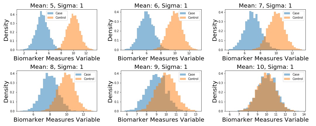
Next up, I generate 5 different datasets. Each dataset corresponds to fake samples from a “Control” distribution, and a “Case” distribution – each is distributed according to a univariate Normal distribution. The Control distribution remains the same in each scenario: , but I change the parameter of the Case distribution in each instance, such that .
We plot the example datasets as follows, and then compute the ROC curves for each dataset.
# define unique means
m1 = np.arange(5,11)
samples = {}.fromkeys(m1)

# define control distribution (this stays the same across
n2 = np.random.normal(loc=10, scale=1, size=2000)

fig, (ax) = plt.subplots(2, 3, figsize=(15, 6))

for i, ax in enumerate(fig.axes):

    n1 = np.random.normal(loc=m1[i], scale=1, size=2000)
    samples[m1[i]] = n1

    ax.hist(n1, 25, alpha=0.5, label='Case', density=True,)
    ax.hist(n2, 25, alpha=0.5, label='Control', density=True,)
    ax.set_title('Mean: {:}, Sigma: 1'.format(m1[i]), fontsize=15)
    ax.set_xlabel('Biomarker Measures Variable', fontsize=15)
    ax.set_ylabel('Density', fontsize=15)
    ax.legend()

plt.tight_layout()
fig, (ax1) = plt.subplots(1, 1)
for mean, case_data in samples.items():

    [spec, sens] = roc(case_data, n2, 100, gte=True)
    A = auc(spec, sens)

    L = 'Mean: %i, AUC: %.3f' % (mean, A)
    plt.plot(1-np.asarray(spec), np.asarray(sens), label=L)
    plt.legend(bbox_to_anchor=(1.04,1), fontsize=15)
    plt.xlabel('1-Specificity', fontsize=15)
    plt.ylabel('Sensitivity', fontsize=15)

    plt.title('ROC for Varying Case Distributions', fontsize=15)
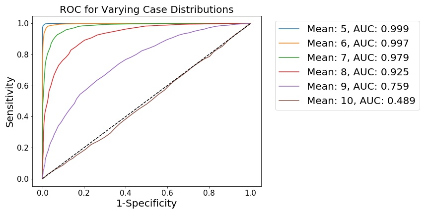
We see that, as the distributions become less separated, the ability to distinguish points from either distribution is diminished. This is shown by 1) a flattening of the ROC curve towards the diagonal, along with 2) the integration of the ROC curve, which generates the AUC metric. When the distributions are far apart (as when the ), it is quite easy for a simple model to distinguish points sampled from either distribution, meaning this hypothetical model has good diagnostic power.
Analyzing Synthetic Dose-Response Curves
We now analyze some synthetic data, generated to look like dose-response curves. As a refresher, dose-response curves measure the behavior of some tissue cells in response to increasing levels of (generally) drugs. The -axis is the drug dose, measured in some concentration or volume, and the -axis is generally some measure of cell death or survival, generally ranging from 0% to 100%. The curves, however, look sigmoidal. So let’s first generate a function to create sigmoid curves.
def sigmoid(beta, intercept, x):

    """
    Fake sigmoid function, takes in coefficient, shift, and dose values.

    Parameters:
    - - - - -
    beta: float
        slope
    intercept: float
        negative exponential intercept
    x: float, array
        data samples

    Returns:
    - - - -
    dose_response: float, array
        single-subject dose-response vector
        Between 0 and 1.
    """

    dose_resonse =  1 / (1 + np.exp(-beta*x + intercept))

    return dose_resonse
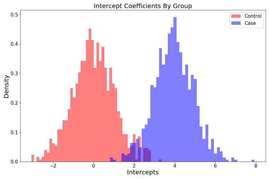
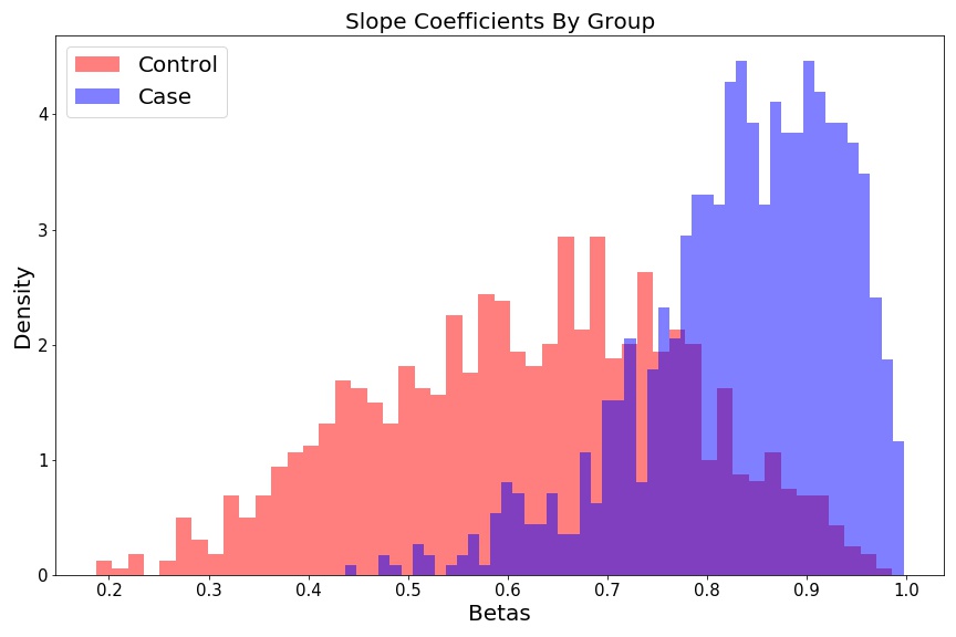
Next, let’s actually generate some synethetic data for a dataset of fake subjects. I want to incorporate some variability into the Cases and Controls, so I’ll sample the subject parameters from distributions. In this case, for each subject, I’ll sample the logistic curve slope coefficient from distributions, and the intercept from distributions. We’ll sample 1000 Cases, and 1000 Controls.
For the slopes, we have
and for the intercepts, we have
As such, the dose-response curve for individual, $k$, is generated as follows:
where and are the slope and intercept values for the given subject. These distributional parameterizations are arbitrary – I just wanted to be able to incorporate variability across subjects and groups.
Let’s generate some random Case/Control dose-response data and plot the coefficient histograms:
# n cases and controls
S = 1000

# dictionary of slopes and intercept values for each subject
controls = {k: {'beta': None,
                'intercept': None} for k in np.arange(S)}
cases = {k: {'beta': None,
             'intercept': None} for k in np.arange(S)}

# get lists of betas and intercepts
beta_control = []
beta_case = []

intercept_control = []
intercept_case = []

for i in np.arange(S):

    controls[i]['beta'] = np.random.beta(a=5, b=3)
    controls[i]['intercept'] = np.random.normal(loc=0, scale=1)

    intercept_control.append(controls[i]['intercept'])
    beta_control.append(controls[i]['beta'])

    cases[i]['beta'] = np.random.beta(a=10, b=2)
    cases[i]['intercept'] = np.random.normal(loc=4, scale=1)

    intercept_case.append(cases[i]['intercept'])
    beta_case.append(cases[i]['beta'])
Intercept histograms look like two different distributions:
fig = plt.figure(figsize=(12, 8))
plt.hist(intercept_control, 50, color='r', alpha=0.5, density=True, label='Control');
plt.hist(intercept_case, 50, color='b', alpha=0.5, density=True, label='Case');
plt.ylabel('Density', fontsize=15);
plt.xlabel('Intercepts', fontsize=15);
plt.title('Intercepts Coefficients By Group', fontsize=15);
plt.legend(fontsize=15);
plt.tight_layout()
Slope histograms look like two different distributions:
fig = plt.figure(figsize=(12, 8))
plt.hist(beta_control, 50, color='r', alpha=0.5, label='Control', density=True);
plt.hist(beta_case, 50, color='b', alpha=0.5, label='Case', density=True);
plt.ylabel('Density', fontsize=15);
plt.xlabel('Betas', fontsize=15);
plt.title('Slope Coefficients By Group', fontsize=15);
plt.legend(fontsize=15);
plt.tight_layout()
Now we’ll generate some fake dose-response curves for each of the 1000 Controls, and 1000 Cases. We’ll plot a subset of these curves to visualize our cross-group curve variability.
# define synthetic dose range
doses = np.linspace(-15,15,500)
dose_min = doses.min()
shifted_dose = doses + np.abs(dose_min)

fig, (ax1) = plt.subplots(figsize=(12, 8))

ec50_control = []
ec50_case = []

for c in np.arange(S):

    control_sample = sigmoid(controls[c]['beta'], controls[c]['intercept'], doses)
    case_sample = sigmoid(cases[c]['beta'], cases[c]['intercept'], doses)

    ec50_control.append(shifted_dose[control_sample < 0.5].max())
    ec50_case.append(shifted_dose[case_sample < 0.5].max())

    if (c % 15) == 0:

        ax1.plot(shifted_dose, control_sample, c='r', linewidth=3, alpha=0.3)
        ax1.plot(shifted_dose, case_sample, c='b', linewidth=3, alpha=0.3)

plt.legend({})
plt.title('Dose Response Curve', fontsize=20);
plt.xlabel('Dose', fontsize=20);
plt.xticks(fontsize=15)
plt.ylabel('Response', fontsize=20);
plt.yticks(fontsize=15)

custom_lines = [Line2D([0], [0], color='r', lw=4),
                Line2D([0], [0], color='b', lw=4)]
plt.legend(custom_lines, ['Control', 'Case'], fontsize=20);
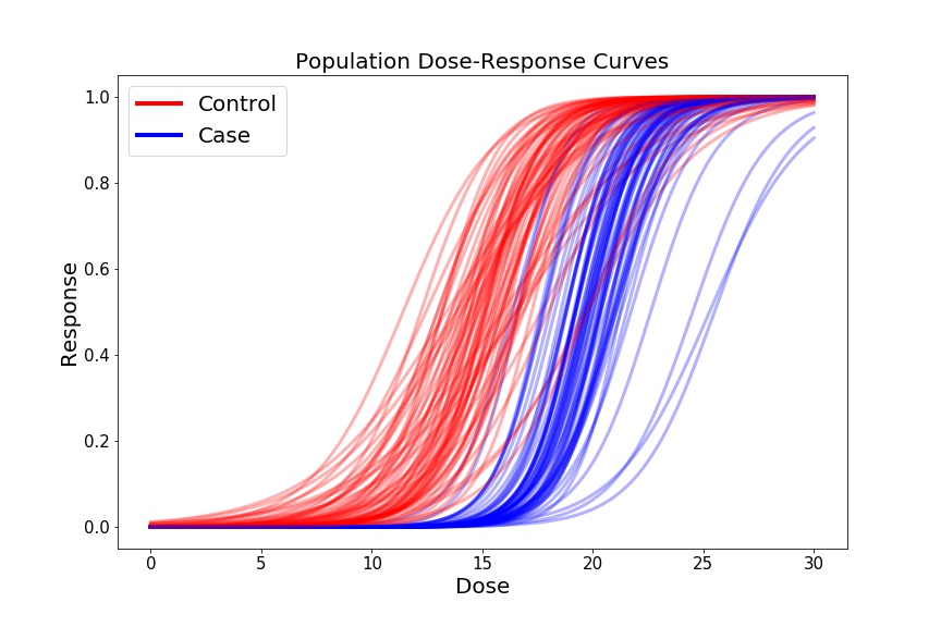
For our preliminary biomarker of interest, let’s look at the ec50, which is the dose at which 50% of the cells show some response (i.e. where our -axis = 0.5), for each sample in our dataset. We’ll plot these doses as a function of Cases and Controls.
fig = plt.figure(figsize=(12, 8))
plt.hist(ec50_control, 50, color='r', alpha=0.5, label='Control', density=True);
plt.hist(ec50_case, 50, color='b', alpha=0.5, label='Case', density=True);
plt.legend(fontsize=20);
plt.xlabel('ec50', fontsize=20);
plt.xticks(fontsize=15);
plt.ylabel('Density', fontsize=20);
plt.yticks(fontsize=15);
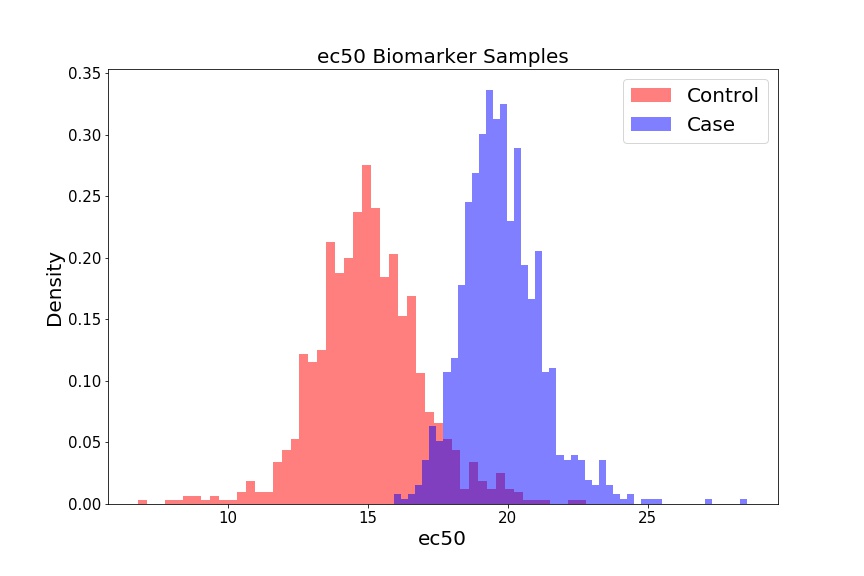
If we select a different threshold – i.e. instead of 0.5, we can iterate over the range of 0.1 - 0.9, for example, in increments of 0.1 – we generate different biomarkers (ec10, ec20 … ec90). We can treat each biomarker as a different classification model, and assess how powerful that model is at assessing whether someone will develop cardiotoxicity or not. To do so, we’ll create distributions for each biomarker (not shown), and then generate ROC curves and AUC values for each curve.
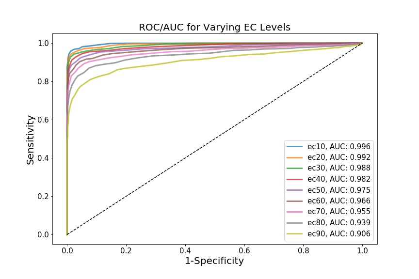
This is where my limited domain knowledge comes at a cost – I’m not sure if the biomarkers I’ve chosen (i.e. incremental ec values) are actually biologically relevant. The point, however, is that each biomarker yields a different AUC, which theoretically shows that the Cases and Controls can be differentially distinguished, depending on which biomarker we choose to examine. In this case, ec10 has the most discriminative diagnostic power.
Something I did wonder about while exploring this data was how dependent the ROC curves and AUC statistics are on sample size. Previously, I’d looked at rates of convergence of various estimators – the AUC should also theoretically show some convergence to a “true” value as increases – but I’m not sure if it follows any sort of relevant distribution. I imagine the AUC is domain-dependent, in that it depends on the distribution of the biomarker of interest? Might be a good idea for another post…
Cheers.